by Bill Desowitz
The Wizard of Oz re-released on home video? Again? That’s a question that’s going to be asked a lot as the studios finally dip into their libraries to release evergreen films, ingrained in our cultural consciousness, in the Blu-ray format. And nothing is quite as ingrained as The Wizard of Oz, one of the most watched and beloved films of all time.
However, if the fledgling high-definition optical format is to flourish before the eventual coming of digital downloading, it desperately needs popular movies such as The Wizard of Oz, which Warner Home Video released September 29 in a “70th Anniversary Ultimate Collector’s Edition,” with enough bells and whistles to put us somewhere over the rainbow.
“What good is a great technology if you don’t have an a mazing movie with which to enjoy it?” asks George Feltenstein, Warner Home Video’s senior vice president, Theatrical Catalogue Marketing. “And, in my mind, there’s not enough film material yet available on Blu-ray to make everyone happy. These films cross boundary lines, and I’m hoping this means that we will be joined by other studios with more classics coming our way.”
As Feltenstein says, “The star of the show is Blu-ray,” and Warner is clearly taking the industry lead in its commitment to the format, spending millions of dollars in digitally restoring not only Oz but also Gone with the Wind and North by Northwest, both of which are turning Blu in time for the holiday season.
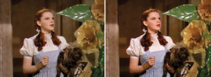
So, what are we going to experience about Oz on Blu-ray that we’ve never seen before? Well, for one thing, the freckles and blemishes on Judy Garland’s face. In fact, this was a revelation for Feltenstein, who says the added detail on Garland’s face brings out more of a warmth and humanity to her portrayal. Additional new details include Toto’s eyes, the mosaic design of the Wicked Witch’s castle, the myriad of colors in Margaret Hamilton’s makeup and a sharper poppy field.
No wonder the Motion Picture Imaging (MPI) digital team at Warner Bros. started from scratch to get Oz right. And through this experience they discovered that, in doing the previous 2005 master, they actually mistook artifacts for grain.
“The reason we decided to start all over again is that we’ve got a new Northlight scanner and we’re now in 8K pin register,” explains Ned Price, vice president, Mastering, Warner Bros. Technical Operations. “By using this scanner, we were able to get a lot more resolution and detail information from the original Technicolor camera negatives. More importantly, the grain is sharper at 8K. As a result, you get less artifacting and less reason to do downstream manipulation like grain reduction and image enhancement, so you’re not basically dumbing down your image and then sharpening it back up again. The grain has not been touched.”
MPI scanned the original three-strip Technicolor camera negatives and then finished everything in film resolution. As usual, the studio’s proprietary Ultra- Resolution process was used for com- positing the separate yellow, cyan and magenta layers for unprecedented registration and sharpness.
Some of the other highlights of the lat- est Oz project include new Baselight soft- ware for aligning to the pixel rather than within the previous 16-grid pattern, the ability to lose all artifacts, density breathing improvements, and the ability to fix all opti- cal issues, including the multi-layered poppy field and Glinda the Good Witch’s pink bubble.
“We were always fighting green on Oz, but could get better balance, thanks to improved density breathing,” Price adds. “We keep finding more native resolution in film-based movies, and haven’t hit the ceil- ing yet for home viewing.”
However, Price and MPI colorist Janet Wilson(who also worked on the 2005 iteration of Oz) were given an invaluable assist with the discovery of an original 1939 answer print (formerly mismarked at the Academy of Motion Picture Arts and Sciences), which enabled them to get more accurate color densities.
“We referenced the ‘39 answer print and saw much more gray range, much more open middle, less red, less chroma than we anticipated––and incredible separation in the print,” Price continues. “We said, ‘My God, how did they do that?’ Part of it is due to the compression that is built into film. You look at that Technicolor print and see the red in Dorothy’s cheeks and wonder how that blends in so well and sits so flat.”
Meanwhile, even the opening and closing sepia reels are improved, despite the lack of original film materials, which were destroyed decades ago in a fire. “Our source is still a 1962 fine grain,” Price con- firms. “It was printed too dense. So by virtue of it being heavy, it looks grainier than it was originally. We didn’t have a sepia reference for those two reels of film. But we got a sepia reference of that era and analyzed the sepia base color values.” MPI was able to take a black-and-white image and make it sepia.
And what about the crucial transition from sepia to color when Dorothy opens the door of her house and steps into Oz?
“I could actually draw a window around that door and color-correct Oz outside and color-correct the room inside differently [because there’s an aperture change],” colorist Wilson explains. “So that’s a smoother transition. What I always see in that transition is a change in grain because you’re moving from fine grain to the original camera negative, so there’s a significant change in the resolution and the sharpness of the image.”
Oz has provided some valuable lessons about how far one can––and should––go visually in HD. For instance, Price decided to remove three wires (from the Scarecrow and Cowardly Lion) because they distractingly picked up light.
“With Blu-ray, people are always saying they are afraid of the seams showing,” Price acknowledges. “However, look at the detail in the makeup, look at the detail in the costumes. If they worked to that granularity, how could you say they didn’t want that level of detail to be seen?”
Often, what MPI worked on was trying to make the seams themselves less noticeable, like the transition between the back plate and foreground. “Because of the characteristics of film, it has a compression just by virtue of that medium, and things did lie flat,” Price explains. “But if you’re taking something from the original camera negative, you do see the raw set. And in grading, that’s when it actually lies flat as a more natural image.”