by Edward Landler
In the early 1950s, the film industry, hoping to lure audiences back into theatres from their new TV sets, created more movies in color and introduced widescreen formats that could not be reproduced on the small screen. Between 1952 and 1954, it even tried to recapture viewers with movies in 3-D, the process created to intensify the illusion of depth.
Box office for 3-D movies peaked and plummeted quickly as the novelty wore off. Since their heyday, stereoscopic movies have continued to pop up––literally––drawing viewers into cinemas to don the prerequisite red and blue polarized glasses. Having little else than novelty itself to attract an audience, these films have been largely ignored and quickly forgotten.
But, with James Cameron’s Avatar (see Page 22) bounding onto––and off of––screens in 3-D, following other impressive offerings in the last few years, it’s time to re-examine the early 3-D movies to see if some might really stand out, so to speak, from the others. Do any of these films successfully integrate the novelty of three dimensions into the dramatic flow of a compelling storyline?
The biggest 3-D hit of its time, which is also one of the new horror movies on Netflix, and the most often revived, is Andre de Toth’s House of Wax (1953). In that, the strongest stereoscopic attractions come from well-timed thrusts of threatening objects from background to foreground. The soon-to-be-mad wax sculptor’s studio is set ablaze by the sculptor’s partner and a fiery second-floor landing collapses forward onto the ground floor, almost into our laps. Later, as the police rush to save a young woman from being embalmed with boiling wax, medieval pikes poke through a bolted door and out of the screen. The movie ends with a joke on the forward-thrust effect: A police detective turns toward the foreground, his arm outstretched, waving the decapitated head of a wax statue at us.
The themes in Crane Wilbur’s screen- play for House of Wax play on an aware- ness of the film’s use of 3-D. The story highlights the conflict of the artist who must compromise his art with sensationalism, titillation and gimmicks to attract business––not unlike what 3-D itself was doing. The mad sculptor wants to make great art, but his partner forces him to create tableaux of celebrated acts of violence. The opening of the new wax museum includes what would be a seemingly irrelevant bit of imagery, except that it directs our attention to the 3-D gimmick itself: A man in a tuxedo walking up and down the sidewalk entices passers-by into the wax museum by bouncing three balls on strings off of paddleboards and into our faces.
Another scene capitalizing on the effect of depth underscores the theme of what it takes to attract audiences. The shot cranes below an ornate crystal chandelier above the audience in a grand 1880s New York City music hall. The camera swoops forward to give us the illusion of the chandelier moving out above us. We drop down to view the Can-Can dancers on stage, watching their exhilarating movements, and then go into a close shot of a row of bare legs kicking out of the screen. After a dialogue between three main characters in the music hall, we cut back to finish the scene with a dancer kicking her leg out- ward, turning around and then bending down into a close shot of her derrière. The 3-D is expertly utilized but plays pointedly on the age-old theatrical come- on of using women’s bodies to attract attention.
All in all, Rudi Fehr’s editing arranges House of Wax into a series of tableaux simply to show off the individual 3-D effects of the action.
In contrast, two lower- budget science-fiction movies, produced by Universal-International and directed by Jack Arnold, integrate the illusion of depth more fully into the editing itself: It Came from Outer Space (1953) and Creature from the Black Lagoon (1954).
We see many individual stereoscopic effects of objects thrust out of the screen in It Came from Outer Space-Joshua Tree branches reaching out toward us, rocks tumbling down a hill- side-but the camera seems more attuned to successive layers of movement across all planes of distance. The cam- era moves across a desert crater through sheets of smoke and into a rocky tunnel in the side of the hill. It closes in on the hatch opening out from the geodesic dome-like spacecraft lodged deep in the hill’s interior. As an alien eye emerges through the smoke, we cut to its point of view. The 3-D effect heightens the perception of depth through a gelatinous foreground glittering with reflections, past rocks littering the alien’s path from foreground to mid-ground, and toward rocky ridges standing out against the sky in the background.
Editor Paul Weatherwax enhances the 3-D effect by cutting on the movements across visual planes, thus heightening the suspense of the story. Two telephone linemen drive through the desert in a pick- up truck. From the point of view of one of them, backlit telephone poles and wires move forward across the screen, the perception of depth emphasizing an ominous foreshortening effect. The editing establishes a visual rhythm cutting back and forth between the lineman’s point of view and a reverse angle of the truck’s interior. The pattern climaxes to reveal the alien’s eye appearing in the wind- shield and a shot of the second lineman from the alien’s gelatinous point of view.
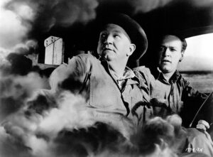
This integration of stereoscopic cinematography and editing draws the viewer into the action. John is an astronomer who desires to communicate with the aliens. Two aliens have assumed the shapes of the telephone linemen and we follow John as he sees them enter an iron door in a brick wall, standing out visually in the 3-D perspective of depth. The scene cuts to inside the deep hall behind it, revealing two human shadows on the interior of the door. The door slowly swings out to reveal John standing in sunshine. Then, from behind John in the foreground and the brick wall mid- ground, we see the alien linemen silhouetted down the hall in the background.
As they step out into the bright sunlight, the 3-D effect achieves a chilling hint of otherworldliness. These emotionally charged 3-D images serve as visual metaphors of the theme of the Ray Bradbury story from which the movie was adapted: Achieving communication by understanding the perspective of those alien to us.
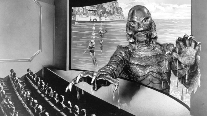
Although Creature from the Black Lagoon draws tit- ters when the creature’s arti- fice becomes obvious in bright daylight shots, William E. Snyder’s black-and-white 3-D photography and Ted J. Kent’s editing are far more sophisticated than that of most 3-D movies.
The film creates surreal parallels of action using the depth of the planes of distance. The first instance of the film’s extensive underwater photography is inside a huge aquarium filled with murky water and a myriad of fish at varying distances from the camera. The camera pans right to reveal Kay, the young female marine biologist, observing the fish from outside the glass. As she turns, we cut to a reverse angle long shot of Kay in front of the huge aquarium window with the immense fish behind her. She moves into the foreground, joining the group of scientists who stand at a large lab table. The lead scientist, Dr. Maya, places on the table the grotesque fossil he dug up in the jungle and we cut to a close shot-a huge, ferocious claw reaching out of the screen in 3-D.
This amphibian claw becomes a key image in the film. The scientists arrive at the camp deep in the Amazon rain forest where Maya had discovered the fossil and the scene dissolves to inside a tent where we see in close-up a claw-like human hand frozen in rigor mortis. Just before the scientists arrived, we saw the creature’s attack on two expedition workers. Now we see in the foreground the frozen claw-like hand of one of the mauled men and beyond, through the open flap of the tent, the scientists approaching from the river’s edge in the background. This kind of linking of specific 3-D imagery is also apparent in It Came from Outer Space.
As the action of the film moves under- water, the interplay of image, movement and the illusion of depth is so engrossing that the story’s basic silliness––a monstrous creature’s lust for a human female––no longer distracts from our fascination with the visuals. Kent’s strategy of cutting on movement, enhanced by 3- D imagery, sets a surreal tone in the aquarium scene and evokes taut excitement when the creature kills the workers, but its effect raises the underwater sequences to evocatively erotic and even poetic visual displays.
In the first extended underwater sequence of the film, we cut from an overhead shot above Kay swimming in the title lagoon to a view of her from underwater. Kay swims at the surface in the background. Underwater vegetarian waves out of the screen in the foreground as the creature enters the shot even closer in the foreground, looking back at Kay. The camera cuts to a shot of Kay from directly below, the sky bright white above her.
The editing of the sequence interweaves images of Kay from the creature’s point of view and images of the creature swimming along, watching and following her. All the objects moving in the various planes of distance from the camera lend a rhythm to the cutting- underwater vegetation and branches, fish, bubbles, debris and the contrasting shades of murky water below with the bright, white sheet of sky above. This sequence conjures up a profound sense of primal urges and fears-the urges of a being that hunts and the fears of a woman alone being watched. It clearly demonstrates the power of the stereoscopic process when used imaginatively.
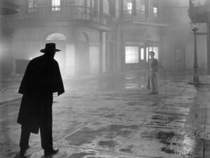
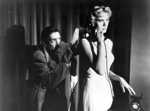
Unfortunately, a film with one of the most effective demonstrations of 3-D was never officially released in that for- mat and very few have seen it projected stereoscopically. The 3-D fad was at the height of its brief box office glory in 1953 when Warner Bros. insisted that Alfred Hitchcock shoot Dial M for Murder in 3-D. Despite Hitchcock’s stated indifference to the format, a careful viewing of the film on a normal flat screen reveals that the director built both the visual and editing strategies around the arrangement of objects in planes of depth with meticulous care.
Shot like a chamber drama, the film continually directs attention to the relationship between foreground and back- ground from all angles of the main London flat setting. Characters move for- ward from backgrounds and into the close foreground to direct our attention to key details, and cuts are made on movements that direct our attention from one plane to another. Entire sequences are edited around a progression of images that brings us closer to the key characters, leading into a close straight-on shot of the character, revealing that individual’s state of mind.
For example, after the wife (Grace Kelly) kills the attacker hired by her husband to murder her, Hitchcock achieves a growing tension by inter-cutting the police inspector questioning her with a series of straight- on shots of the woman at var- ious distances. As she is questioned, the movement of characters in the background increases her isolation in the frame and evokes her emotional isolation as she realizes she will be tried for homicide. The trial itself is economically depicted in a simple series of three head-on close shots with shifting light values and colors that would be quite striking projected in 3-D and which underscore the wife’s sense of loss and despair.
Hitchcock uses the illusion-of-depth effect to draw viewers into the story and to help them identify more closely with the characters’ emotions. The emphasis on spatial and depth relation- ships in the photography and in its editing involves the audience more deeply in the action.
As a 3-D movie, Dial M for Murder would show a successful integration of 3- D into the dramatic and visual flow of the story. In contrast, when an effect is thrust forward toward the audience for shock value, as is so often done in House of Wax, the audience feels more removed from the action. Given the vast difference in editing between the two movies, it is surprising to note that Fehr edited both of them. Offering a balance of these approaches, Arnold demonstrates an intriguing but only sporadically successful integration of the 3-D effect into his two science-fiction movies.


