by Dan Ochiva • photos by John Clifford
So what advice would you expect from a Pulitzer Prize-winning playwright father to his younger son, who will be editing the first feature film of his eldest son?
“Just cover his ass,” John Gilroy, A.C.E., laughs.
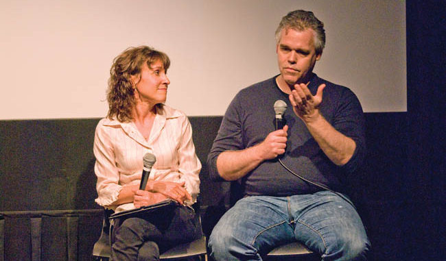
That answer drew a delighted response from the audience at the 92YTribeca screening room one evening this past May. Gilroy was being interviewed by Bobbie O’Steen, the writer and editor behind The Invisible Cut: How Editors Make Movie Magic, who was hosting the second in a screening series that pairs a well-received film with an appearance of its editor at this downtown extension of New York’s renowned 92nd Street YMHA.
That all-in-the-family moment exemplifies the easy-going camaraderie that was key to pulling off director Tony Gilroy’s Michael Clayton (2007). Already a respected screenwriter (the Bourne trilogy, Armageddon), Tony Gilroy’s first feature––modestly priced by today’s standards at $25 million––needed to come in on budget and on time, especially with a megawatt star like George Clooney in the lead role.
“I think my father figured that since I had already edited many features, and this was Tony’s first as a director, he would be in good hands,” says John Gilroy, who received both ACE and BAFTA nominations for his work on Michael Clayton. Although he was working for his brother, he followed his standard approach to creating a positive, working relationship with a director. “I’ll usually find a strong scene early on to edit; I get it into shape and then show that to the director while he’s still shooting,” he says. “This exercise, which is repeated throughout the shoot, breeds trust between us and usually bolsters his confidence in what he’s doing.
“Some directors will allow you to edit practically the whole film before they look at your cut,” continues Gilroy. “But I really hate to work that way. I think an interactive relationship with a director from the beginning is key.” Instead of traditional storyboards, director Gilroy developed a video storyboarding technique, according to Gilroy. The two of them, along with cinematographer Robert Elswit, ASC, used a small camcorder to videotape locations and angles for shots, and took turns standing in for Clooney in certain scenes. In one case, they mounted cardboard cutouts of horses on a hilltop for a crucial sequence. Gilroy then edited these sketches together and, in one case, even added an explosion on the audio track. “It was kind of silly but it really helped us understand the scene,” says Gilroy.
“Video storyboarding this way gets your gears turning and lets you ask, ‘Should we do that?’ or say, ‘We could do this differently,’ he adds. “In Duplicity [2009], which was the second film we did together, Tony used this even more. That meant I was cutting a number of video sketches together during pre-production just to help him understand what he was going to want.”

But even with such determined preparation, Gilroy does offer a word of warning. “You should never have the words ‘dawn’ or ‘pre-dawn’ in a script,” he says with a laugh. “We had searched and searched for the best location for a key scene where Clooney’s character has an almost mystical encounter with three horses on a hilltop. Tony and I remembered an area near where we grew up as kids [north of New York City], and that turned out to be the location we needed.”
However, to achieve the look and feel the director wanted, it had to be shot during magic hour––that short time in the morning and evening when the sun is just at the horizon. “That decision put a lot of pressure on the production, since we couldn’t afford to spend days there just for those short moments,” says Gilroy. That led to the decision to shoot a car-chase sequence at the same location, something that could be done around the same time so that the production could continue working.
“In retrospect, we probably could have done this green screen,” confesses Gilroy. “But we did it old school; we just drove.” Since these shots also needed to have the same twilight look of the hero scene on the hilltop, Gilroy made sure the director and DP knew exactly what they needed to complete each day by continuously editing together shots, as they were completed, in the sequence. Title cards with correct timing were slugged in for any missing scenes––CAR MAKES A SHARP LEFT––so that the crew knew exactly what shots were needed to match surrounding shots.
Family Affair
Gilroy could field a good part of a production with his family in tow, since Dan, his fraternal twin, is also a screenwriter, and their father, Frank D. Gilroy, is a writer and director (he penned the Broadway favorite The Subject Was Roses). “I guess I’ve always harbored aspirations to direct,” he says. “I got into editing because a lot of my hero directors––like Hal Ashby and David Lean––had been editors. But after college, I wasn’t sure exactly what I wanted to do. I sort of stumbled into editing. I ended up just working a lot, made my way up the ladder, and finally got a chance to cut.”
That was when the Moviola was still king. “Editors my age are about the last film guys,” says Gilroy. “I learned to cut on upright Moviolas and did so into the early ‘90s. My first nonlinear experience was on a Lightworks when I was working with Jeff Wolf. Then I later switched over to Avid when I was editing by myself.”
While he might enjoy the speed and ease of changing edits with a digital setup, Gilroy still feels that film had given him something he sees missing in younger editors. “Every splice showed when you edited film,” he says. “If you changed too much, you ended up with short bits of film that were hard to handle, or even had to go to the expense of another work print. I thought more about my editing structure before I made that first cut. I think I learned more discipline.”
The discipline leads him to his current, straightforward notation system. “I know some editors use elaborate workflow charts, but I have a very basic system,” he explains. “I have a wall chart with each scene listed on it. I put a red X next to the scene after I’ve cut it and really worked it. That’s about it. For each completed version of the film, I designate a letter. The first pass is A, the second B, and so on. There are some movies that I’ve almost gone through the whole alphabet, but with Michael Clayton I only got to H.”
That comparatively tight editing is a result of the tidiness of the script, but also the exacting visual style of the film. “It’s a movie of beautiful frames,” adds Gilroy. “Michael Clayton was a very specific film. It wasn’t a matter of going out and shooting a lot and then coming back and saying, ‘Well, what have we got here?’”
With brother Tony an accomplished photographer with an eye for exacting framing, the look of the film was specifically intended as homage to the films of the 1970s, such as Alan Pakula’s Klute. Similar to those films, Michael Clayton employed 2.35:1 anamorphic widescreen to create wide vistas where single characters could be isolated within the expanse to indicate the cold, corporate world within which the protagonist worked.
Sometimes an editor solves a problem by making a slight change that resolves a nagging feeling in the audience. “After a test screening, we had a number of people wondering about the significance of the horses,” says Gilroy. The three horses appear again at the end of the film where Clooney’s character—who is exhausted by his world falling apart around him––approaches them and seems to find some solace. But they really had no other function within the storyline.
“We created another version of the red game book Clayton looks through for clues at one point,” says Gilroy. “We showed him looking at a page that had an etching of a horse within a seemingly important book, so viewers now had something to relate the horses to, even though it didn’t explain anything more than before.” Satisfied by this slight change, viewers would stick to the ongoing storyline and not wander off.
In showing the film’s penultimate shot, Gilroy pointed out how important reducing the visual information can be—something most blockbuster cinema can’t seem to understand.
That shot, a long dolly that follows Clayton from the front as he walks away from Tilda Swinton’s character (who has collapsed, out of focus, in the background), “could have used any other of the multiple cameras we had covering the scene,” says Gilroy. Those focused shots, close-ups of Swinton reacting and collapsing in a heap, would have been de rigeur for most journeyman editors—after all, doesn’t the audience want to see her reaction in full?
“But that’s a case where less really is more,” Gilroy explains. “By focusing only on Clooney while still showing an out-of-focus action in the background, the viewer makes up that character’s whole disintegration in their minds, which turns out to be much more powerful.”
Gilroy had just wrapped up work on another feature, Gavin O’Connor’s Warrior. Will he work with brother Tony again? “Of course,” replies Gilroy. “Working together brought us closer. Everyone was asking us, ‘Are you two going to fight?’ No way. We like each other. We agree!”

