by Bobbie O’Steen
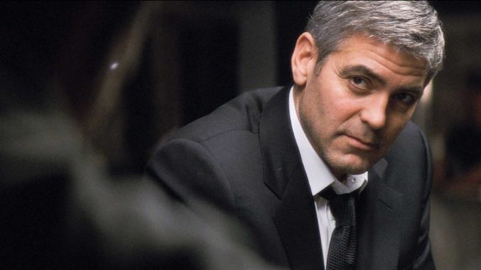
Michael Clayton has been described as a thriller, but it’s more about “soul sickness,” according to writer-director Tony Gilroy, about people who find themselves in exile facing moral dilemmas. As a result, his brother, editor John Gilroy, A.C.E., had to make sure the audience stayed inside the characters, while creating a subtle build-up of tension throughout. The filmmakers also created a specific look, which paid homage to movies from the 1970s, in which composition within a widescreen frame showed empty rooms, empty places and people alone.
The Gilroy brothers were able to create that feeling in the opening montage when Arthur (Tom Wilkinson), a pivotal character, delivers a monologue over a series of shots that establishes his law firm. They had to be careful not to show anyone else’s face, which the audience might connect to Arthur’s voice (since he is not seen until almost 28 minutes later), or show anything that would distract them too much from Arthur’s bizarre and brilliant rant. At the discussion after the screening, John showed us one of several earlier versions of the montage, which was more visually complex. He explained that they kept stripping the content of the shots back until the montage became a series of tableau shots, making the offices look both empty and mysterious.
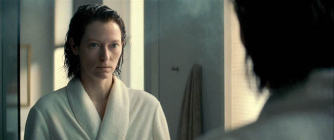
John made the most of that “lonely” framing in a scene that establishes another pivotal character, Karen Crowder (Tilda Swinton). This was the first scene John cut, and he told his brother he was going to “try something different.” This made Tony somewhat nervous until he saw the scene, then said, “Here’s another person who is totally going to take care of me.” Tony said the scene was originally structured as a “set up and punch line,” with Karen rehearsing her speech in her apartment, mostly in front of a mirror. This was to be intercut with her delivering the speech, as the new general counsel in her company’s conference room.
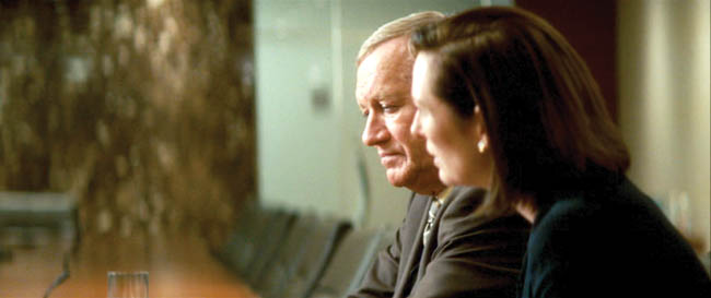
John created a more elaborate embroidery of those two elements than had been originally conceived, cutting back and forth more often, “playing off words more, playing with the chronology,” creating a delicate balance by “looking at her eyes” and the “nuances of the face.” By cutting this way, John underlines the fact that Karen is barely up to speed for this job and establishes that while she may become a villain, she’s also vulnerable.
Toward the end of the editing process, the movie was a bit long and there is one subplot that was in question. There were two scenes involved, the principal one revealing a secret romance Michael has with Brini, a lawyer from his firm. It’s supposed to be a brittle affair that shows another dead end in his life. When it was taken out, the filmmakers realized that some people in the preview audience had pinned their hopes on it and wanted it back in, thinking this was a connection Michael should cling to. This made them even more resolved to keep the romance out, since it could distract from the movie’s ultimate intentions for Michael’s character.
Deleted scenes can create a domino effect, which in this case was positive: The scene came at a suspenseful and critical time for Arthur’s character and slowed the movie down. The relationship between Michael and Brini also happened to be beautifully acted and written, but sometimes you have to be able to “kill your darlings” in order to do what’s best for the story––an invaluable lesson John had learned many years before from his father.


